Decal Design Decision


Throughout the project there has been a lot of talk surrounding how the team wanted the environment to be perceived. The team started out unsure if we wanted the warehouse to look dirty, stylized or even made to look freshly clean. After a lot of thought and consideration the team decided to make the warehouse and carpark scene worn down and dirty. However we still wanted some aspects of the warehouse to be preserved. The general look we wanted to accomplish was like the environment had very little up keep. With the use of multiple dirt decals as well as overlays and positioning we have been able to create more worn down textures with tyre marks as well as scuff marks.
Although the car park is only shown at this stage for the intro/cutscene at the start of the game, we felt it needed more polish and some refinement. New decals and an overall paint job of the scene has been completed. No parking zones have been implemented and pillar numbers added to match with real world environments.
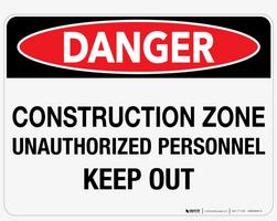
Signs and posters to replicate that of a construction and hazardous area have also been created and are due to be placed around the map. References from the lumber yard at Mitre 10 and also Bunnings assisted the team in placement for signs, distance between signs and also layout of markers along the storage area floor.
Unsighted Agent
A voice-controlled heist game.
| Status | In development |
| Author | Unsighted |
| Tags | Heist, voice-controlled |
| Languages | English |
More posts
- Game Release and Final Dev ThoughtsAug 21, 2022
- Creation of the hacking minigameAug 17, 2022
- Making a Voice Controlled Character: Part 3 - The finer detailsAug 17, 2022
- Fuse box minigame: From concept to prototype to realityAug 15, 2022
- UI Design DecisionsAug 15, 2022
- Developmentation of a "trailer/Gameplay trailer" how it went.Aug 15, 2022
- Model Design DecisionsAug 12, 2022
- Making a Voice Controlled Character: Part 2 - Designing the controllerAug 11, 2022
- Making a voice-controlled character: Part 1 - implementing the speech recogniserAug 03, 2022
Leave a comment
Log in with itch.io to leave a comment.