UI Design Decisions


For the ui designs we didn't want to go too crazy and wanted to go simple as we could since we didn't have the biggest of ideas when it came to ui but we did consider on what become of it in the game.
For font we wanted something that didn't look too complex and wanted a type of font that people could read. First font choice was somewhat hard to be read so we ended up changing it to a better font style in the end.
We wanted to add a money bar ui for the player to see where they are at when getting collectables around the warehouse. So we made the UI design for it to be simple with having a money bag sprite to let them know thats what the bar is for. Nothing that looks too out going.
When starting out thinking of a winning screen and losing screen for the game, the winning screen sketch idea was very good, but when it came to the sketch idea for the losing screen it seemed a bit all over the place so we ended up just going the same idea for the winning screen for the losing screen just taking out the total, time, and just adding what was the cause of death and giving the option for restarting and quitting.
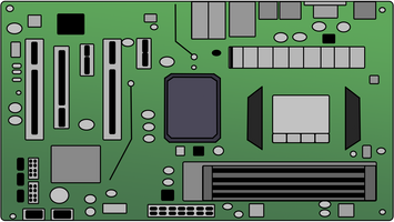
The Minigame ui design it was confusing to know exactly what was wanted at first since all that was given as description was Motherboard UI and there wasn't any reference of what precisely was wanted which was confusing but to get somewhere references were gathered and work started and got done for it.
Unsighted Agent
A voice-controlled heist game.
| Status | In development |
| Author | Unsighted |
| Tags | Heist, voice-controlled |
| Languages | English |
More posts
- Game Release and Final Dev ThoughtsAug 21, 2022
- Creation of the hacking minigameAug 17, 2022
- Making a Voice Controlled Character: Part 3 - The finer detailsAug 17, 2022
- Fuse box minigame: From concept to prototype to realityAug 15, 2022
- Developmentation of a "trailer/Gameplay trailer" how it went.Aug 15, 2022
- Model Design DecisionsAug 12, 2022
- Making a Voice Controlled Character: Part 2 - Designing the controllerAug 11, 2022
- Decal Design DecisionAug 08, 2022
- Making a voice-controlled character: Part 1 - implementing the speech recogniserAug 03, 2022
Leave a comment
Log in with itch.io to leave a comment.